|
Welcome to our latest re-vamped client |
Rethink Productivity

Meet Our Latest Client - ReThink Productivity
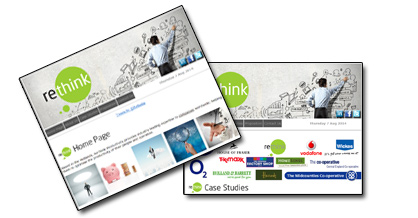
Based in Shrewsbury, ReThink Productivity provides industry leading expertise to companies worldwide; helping them to optimise the productivity of their people and operation.
Directors Simon and Sue, along with associate director Matt have over 50 years’ experience working within a variety of retail organisations and within productivity and Work Force Management.
Companies ReThink have worked with include House of Fraser, BP, Wickes, Republic, Vodafone, Boots, H&M, Central England Co-op, The Original Factory Shop, Holland & Barrett, 02, TK Maxx, Home Sense and Holiday Breaks. The website features case-studies from a selection of these.
Social media links , including a Twitter feed are included on the site to ensure content is up to date, reflecting latest retail developments and endorsing Re Think as a leading expert in this arena.
Our quality speaks for itself
We are proud to create websites that really do the business for our diverse portfolio of clients. Don’t just take our word for it, see for yourself by clicking on the thumbnail images to find out more about the client, the brief, the creative & the results and to see how we have helped companies like yourselves to get noticed:
Our Client Portfolio
|
|
|
|
|
The Royal Hotel |
Court Royal |
Aviation Postcard |
Gels & Gems |
Reeve Metal |
|
|
|
|
|
GOTOROB Travel |
Rose & Crown |
Rethink Productivity |
Village Mowers |
Tots at the Top |
|
|
|
|
|
Easy
Lifter |
Costock
Village |
Carl Brooks Plumbing |
Wysall |
Tony
Starmer |
|
|
|
|
|
The
Bungalow |
Grange
Farm |
Gardenmates |
Goldring Sounds |
|
|
|
|
|
|
Rembering Colette |
Wright Electrical |
Business
Advice |
Leisure
Lounge |
SM Telecom |
|
|
|
|
|
Economy Pest - SP |
Economy Rod - SP |
Willoughby |
Thermal Layers |
Economy
Kill |
|
|
|
|
|
Lace
Market |
Esprit
Transport |
Plough
Wysall |
Esprit
Education |
Crew |
|
|
|
|
|
LTG |
Economy
Rod |
Koine |
Anne
Howie |
J
Autocare |
|
|
|
|
|
Helios |
A1
Aerials |
Merz
Decor |
LSM
Print |
Broad
Willow |
|
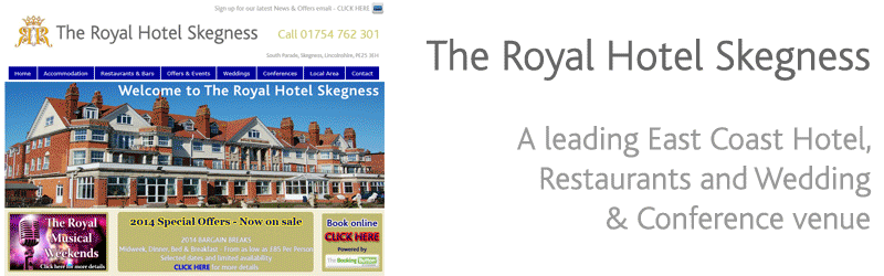
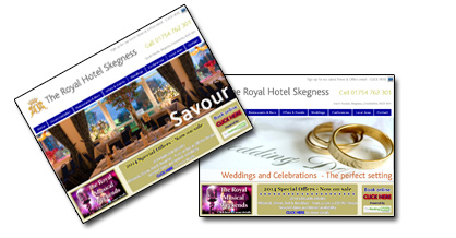
| the
client - Leading East Coast Hotel, incorporating Grill and Indian restaurants, targeting leisure-break customers and also offering Wedding, Party and Corporate venues.
the
brief - a redeveloped website was required to ensure it is maximising impact for the overall business and each individual element within it (Special Offers, Viceroys, Indian restaurant, Weddings, etc.). To develop and manage a supporting regular HTML email campaign, along with on-going website content management, ensuring web updates are consistent and undertaken simultaneously. |
the
creative - an elegant, classic, stylish ‘look and feel’ in line with the hotel itself, based on gold, cream, chocolate, burgundy colour palette. Includes more impactful visual appeal imagery to really stand out from competitor websites - animated banners, online portfolio galleries reflecting the attractive surroundings (restaurants, bar, garden, etc.) and special touches (décor, features, place settings, quality cuisine). Also includes regular strong value offers in less garish yellow imagery, consistent with printed literature produced.
the
result - collection of email addresses of customers, enquiries or visitors, more visibly on the website and in the hotel, emailing regular offers & updates in a faster, more cost-effective and paperless environmentally friendly way, boosting site visitor levels when each email newsletter is circulated directing recipients to updated site content – and overall generating bookings and filling available capacity. |
|
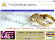
| the
client -12 self-contained holiday apartments, offering comfortable self-catering accommodation, with a range of options including balcony & sea-view apartments and ground floor apartments with no steps which are ideal for wheelchairs.
the
brief - to create an impactful, up to date and visually appealing look with colour palette/creative style to give a ‘holiday’ feel, in line with target audience and to include more impactful visual appeal imagery to maximise visitor appeal & stand out from competitor websites. |
the
creative - a 4 page website including Home page (Welcome, About the business, Map & Directions & Special offers), Apartment Options (at a glance and with floor plans and photographs of Kitchen, Lounge, Bedrooms, Bathrooms, Sea views) and Local Area & useful links (Local Amenities, places of interest, activities & services and Contact details.
the
result - includes online portfolio gallery to visually convey the quality accommodation (kitchen, lounge, bathroom, bedrooms, views, etc.), animated banners to introduce, movement and variety of imagery, easy to use site structure to maximise ease of navigation around the various sections for anyone visiting the website and downloadable PDF’s which customers can print off (e.g. local area attractions, useful information, guidance for guest on opening up and closing down the accommodation, etc.). |
|
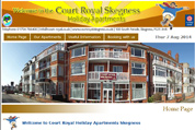
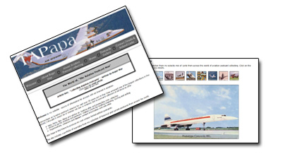
| the
client - Roger May, an Aviation enthusiast for over 40 years, Aviation professional for 35 years, Postcard collector over 30 years with one of the largest collections in the World and award winning aviation photographer, based around the area of London Heathrow Airport.
the
brief - to develop a source of information for anyone with an interest in aviation and postcard collectors including help, hints, tips, ideas and advice on looking after and protecting collections, where to go for Aviation and postcard related events for trading swapping buying and selling and Organisations, collectors and dealers contact information and web-sites. |
the
creative - includes Aviation Postcard collecting and groups of collectors including Airline or Company issues, Airports and Airfields etc., specific type or types of Aircraft , such as “Concorde”, Helicopters or Airships, specific periods of aviation, such as The Early Pioneers or between the wars, particular printer or publisher, such as “Real Photographs” (UK), or “Editions PI” (France) and Military collectors, concentrating on a particular conflict or war, involving aircraft and aviation. I also hope in the future to produce my own unique limited edition postcards.
the
result - includes Recent & Forthcoming Postcard Shows, where Roger is exhibiting, Postcards Gallery including Prototype Concorde 001, A De Havilland DH-89 Rapide aircraft, Louis Bleriot. Aviation pioneer, Airline Issue. De Havilland Canada Dash 7 aircraft of “Air Niugini“, A hot air Balloon, advertising the original “Mini 850” A Zeppelin airship LZ 3, A Fokker F27 aircraft of the Royal Netherlands Air force, A 1950s view of London Heathrow Airport, A Helicopter over NYC and an interior view of a passenger aircraft in the 1970s. The website content is updated periodically to include new issues of interest. |
|
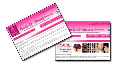
| the
client - Gels and Gems Beauty, based in Cheswick Green, Solihull, a beauty treatment specialist, personally run by Julia Chambers, a fully qualified Calgel beautician with over 15 years’ experience in the beauty industry, specialising in Gel Nails, Waxing, Manicures & Pedicures and Spray Tanning.
the
brief - a stylish, impactful, up to date and visually appealing website was required to stand out from competitor websites, generate wider awareness & attract new customers searching online for the services offered. |
the
creative - creative ‘look & Feel’ based on a cerise pink, gold & black colour palette, to achieve a current and inspiring style, appropriate for a beautician , with 3 page site structure including Home page (about the business, client testimonials), Products Used & Services Offered (with logos) and Contacts/frequently asked questions.
the
result - inclusion of photographs & logos to depict product range & quality and maximise visual impact & appeal, along with logos and links to products used (Calgel nail enhancements, Calspa pedicures, Nailtigues Manicure & Pedicure and A List bronze spray tanning). Also includes a Twitter feed to update Twitter, Facebook and the website, with examples of latest treatments, keeping content fresh and current. |
|
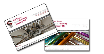
| the
client - a family owned business, established for over 100 years, with a highly skilled & motivated workforce, an excellent reputation and a strong track record of customer satisfaction, offering fast reliable turnaround throughout the UK & Ireland and worldwide.
the
brief - to redevelop existing website, creating a more impactful, up to date and visually appealing look to stand out from competitor websites to generate wider awareness & attract new customers searching online for the services which you offer. |
the
creative - a 5 page website including Home page (about the company & incorporating the current Profile information on Safety and environmental endorsements), Zinc, Nickel & Chrome, Anodising and Contacts/FAQ's
the
result - includes an online portfolio gallery using photographic images to reflect the diverse range and high quality of metal finishing services , logos & links to related sites (Industry bodies, Safety & Environmental standards & accreditations, etc.) to attract more visitors to the website and a range of frequently asked questions to endorse company expertise and wide experience. |
|
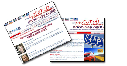
| the
client - Fiona Henderson, offering a home based travel booking service saving expensive High Street Travel Agency overhead costs, total reassurance of being fully ABTA & ATOL bonded, backed by the Cooperative Travel Group and access to special rates, discounts & last minute holiday bargains.
the
brief - website required to include cheap package holidays from leading tour operators, short city breaks, cruises, faraway holidays, flight + hotel deals, flight-only and ski breaks. |
the
creative - includes atmospheric idyllic holiday ‘feel good’ creative style with destination imagery and sunshine colour palette, with profile and photographs of Rob and Fiona to emphasise the extensive travel industry experience, expertise & contacts and friendly, individual, helpful, local personal service.
the
result - includes ongoing campaign management of regular email newsletter updates to existing and potential customers, with collection of email addresses of customers, enquiries or visitors, via the website, sending regular news & updates in a fast, cost-effective & paperless environmentally friendly way. Overall boosting site visitor levels when each email newsletter (Holiday hotspots, hottest holiday deals) is circulated directing recipients to updated site content. |
|
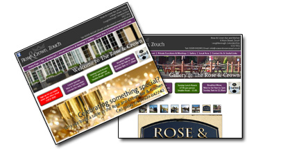
| the
client -The Rose & Crown Inn & Restaurant, Zouch, a long-established and popular local venue offering quality home cooked food in a traditional canal side pub setting .
the
brief - a website was required to generate wider awareness & attract new customers searching for pubs, inns, restaurants, etc., online, including an online portfolio gallery of photographic images reflecting the attractive surroundings (restaurant, bar beer garden, etc.), special touches (décor, features, place settings) and quality cuisine on offer.
|
the
creative - a newly developed logo with a contemporary yet classic style for the six page website including Welcome, Special Menus (Pie Night, etc.), Events & Seasonal Occasions, Restaurant (with Sample menus and downloadable PDF’s of actual menus (Christmas, Mother’s Day, Valentines, etc.), Private Hire (Weddings, Parties & Other Celebrations, Corporate (Meetings, Lunches, Facilities – Wi-Fi etc.) and Local Area (with Map & Directions, Local Amenities & places of interest and Local activities).
the
result - a visually appealing style which combines a clear, classic and contemporary English pub look. Regularly updated content including Special menus and events (significantly faster & easier to change content online than in printed materials). |
|
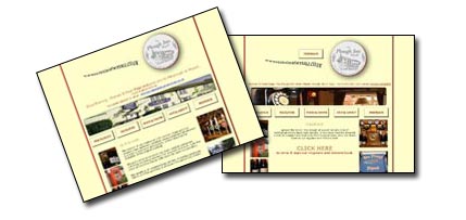
| the
client - Based in Shrewsbury, ReThink Productivity provides industry leading expertise to companies worldwide; helping them to optimise the productivity of their people and operation.
the
brief - a website redevelopment was required to reinforce the extensive expertise and experience of Directors Simon and Sue, along with associate director Matt, who have over 50 years’ experience working within a variety of retail organisations and within productivity and Work Force Management. |
the
creative - a five-page website incorporating logos of companies ReThink have worked with including House of Fraser, BP, Wickes, Republic, Vodafone, Boots, H&M, The Original Factory Shop, Holland & Barrett, 02, TK Maxx and Home Sense, along with case-studies from a selection of these. Relaunched ‘look and feel’ incorporates the client’s new logo and whiteboard idea generation graphics along with ‘cash-saving’, ‘time-saving’, ‘opportunity magnification’ imagery demonstrating benefits of the services offered.
the
result - an easy to navigate, clearly laid out website providing the right balance of information on services offered. Effective use of Social media links, including a Twitter feed are included on the site to ensure content is up to date, reflecting latest retail developments and endorsing Re Think as a leading expert in this arena. |
|
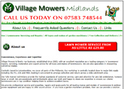
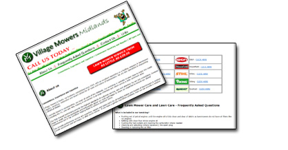
| the
client - a family run business, established since 2003, with an excellent reputation as a leading company in lawnmower repairs, servicing, restoration and expert advice for all types and makes of lawnmowers. Centrally based in Leicestershire and covering all parts of the Midlands.
the
brief - a website was required to generate wider awareness & attracting new customers searching for lawnmowers and mechanical garden equipment servicing & repairs online and endorse the business as a professional forward-looking company. |
the
creative - a one page site structure including About Us (Established family business, Locally based, High standard, fully qualified technicians and Professional Service and Expertise) and Services Offered (Repairs, servicing, restoration and expert advice for all types of lawnmowers & Blade sharpening).
the
result - an animated graphic using cartoon mower image to strongly convey the frustration of a non-serviced mower ‘conking out’, inclusion of logos and links to related sites for all leading makes of garden machinery (Mountfield, Honda, Farr, Hayter, Bosch, Qualcast, Flymo, Briggs & Stratton & Kawasaki), Lawncare Hints & Tips and map of delivery/collection catchment. |
|
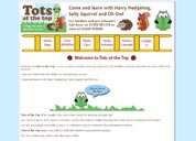
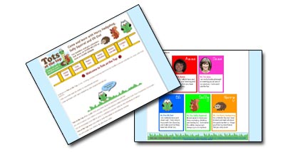
the
client - a new, exciting, creative learning experience for toddlers and pre-schoolers to enjoy with their parents. Tots at the Top was the inspiration of two full time mums who recognised the importance of spending quality time with their children, helping them to learn from a very young age.
Recognising the need for creative, fun and sometimes rather messy activities, Tots at the Top was evolved with creative learning as its main theme allowing for the mess to be made elsewhere. Parent and child can have fun learning and socialising together.
the
brief - a website was required to generate wider awareness & attract new customers searching for pre-school activities online, including an online ‘brochure’ outlining the activities offered and endorsing the new venture as highly qualified, professional & trustworthy. The site included locations of classes, information on how the sessions can help you develop your child and printable downloads of session materials. |
the
creative - a specially-designed logo, strapline (Help your child climb the ladder to educational success!) and supporting imagery (Come and learn with Harry Hedgehog, Sally Squirrel and Oli Owl)
were included to give visual impact and appeal to the target audience of parents with pre-school children. The logo was adapted & optimised to be fast-loading on the website and character images (with speech bubbles) & photographs of session-leaders were also included.
the
result - a consistent brand identity was developed across a range of printed materials (business cards, banner & stand-graphics for session venues & events, etc. The website & full suite of supporting POS materials were all live and in place for launch at a major ‘Lark in the Park’ event. |
|
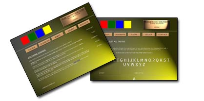
| the
client - goldring
sounds mobile DJ and roadshow, Nottingham
the
brief -More
& more disco bookings are made via the website. Goldring were keen to move
from their previous policy of local press advertising & word of mouth promotion,
to an eye-catching website, ensuring they would be seen in the right place when
bookings are made.
A website was required to:
- communicate
the various services offered and types of occasion covered by the client
- reassure
people when booking this important element of their special celebration about
the advance planning to make the event successful
- demonstrate
the types of music to suit all tastes, showing a small selection of the music
on offer
- provide
a series of personal references from satisfied customers.
|
the
creative -The look &
feel of the site reflects the flashing lights and the hazy excitement of the party
dance -floor.
goldring sounds are shown to be the experts you can trust
for your special event - your local DJ (choice), for every occasion (celebrate),
making parties go with a swing (party), music to suit all tastes (select).
the
result -A clever mix
of contemporary design and reassuring copy. Particular like was the mini 'database'
showing some of the music available and offering to find it for customers if not!' |
|
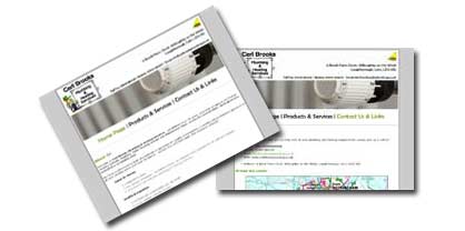
| the
client - Carl Brooks Plumbing & Heating offers Installations & Upgrades, Kitchen & Bathroom Installation, Replacement & Repairs, Wet room installation, Under-Floor Heating Systems and Servicing, Maintenance & Repairs
the
brief - Although many plumbing jobs can be tackled by a DIY enthusiast, a website was required by this highly experienced, Gas Safe registered plumber and heating engineer to emphasize the benefits of using a qualified plumber or gas fitter, taking any hassle & stress out of the project and giving reassurance that the appliance has been properly fitted & fully checked.
|
the
creative - The client’s existing logo was adapted for the web, ensuring it is optimised to be fast-loading whilst retaining consistency with business cards, letterheads, and van graphics etc. Photographs depicting the business were included to add visual impact & appeal.
the
result - – Information about the business, client testimonials, an online brochure of products & services, logos & links to related sites (Quality products used, Gas Safe accreditation, etc) helped to provide reassurance about the experience, quality and expertise offered by our client and to generate wider awareness & attract new customers searching for plumbing & heating services online. |
|
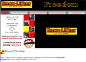
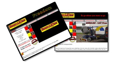
| the
client - Easylifter approached us to develop two websites - one for their range of lifting
equipment for motor homes, motorbikes and mobility scooters, the second for their
traffic control vehicle recovery product.
the
brief -
A website was required to generate wider awareness & attract new customers
searching online, create an online brochure of the lifting equipment available
and to target Cycling, Mobile Homes, Disability-related audiences who are not
aware of the products. A second website was required targeting vehicle recovery
organisations.
|
the
creative - The existing easylifter logo was adapted with moving imagery adding visual impact
and demonstrating the lifting product in action. The Simple, clearly laid out
navigation ensures the site is visitor & search engine friendly.
the
result - Aspirational headers were incorporated to add a lifestyle appeal
'Freedom,
to go where you want to go, to do what you want to do' with flash animated graphics
introducing the messages. The site was also positioned
as 'The Official Manufacturer
& Supplier of Easylifter systems' with a specially-designed stamp of endorsement
supporting this. Overall the Managing Director was 'delighted' with the sites
and the service received. |
|
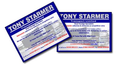
| the
client - A Leicestershire-based transportation company, with over 30 years experience,
an excellent reputation and proven track record.
the
brief -
A website was required to target potential customers searching online for Road
Haulage services, including large and small projects across the UK.
|
the
creative - The existing logo was adapted using flash animated graphics to add web-impact,
whilst remaining consistent with the static versions used in printed materials
& van-signage. Van imagery was also introduced as a background. The site was
clearly structured with easy to follow navigation enabling visitors to locate
what they are looking for including company & fleet information.
the
result - A simple, straightforward site structure for ease of visitor use. The site was
structured & optimised to aid search engine take-up and is being regularly
submitted to leading search engines to maximise ranking when people are searching
for the facilities offered without knowing the exact website address. |
|
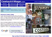
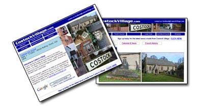
| the
client - The latest in our growing band of local Parish Council websites, the Nottinghamshire
village of Costock recently approached us to develop a village website.
the
brief -
A website was required to include an online notice board of forthcoming events,
a gallery of what's been happening, current & historical village photographs
& information and all the latest Parish Council news.
To ensure this is
a community website for the village, Costock residents, ex-residents, friends,
family & colleagues were encouraged to publicise events being organised and
to contribute information about bygone times.
|
the
creative - A fresh blue sky colour palette emphasises the rolling countryside aspects surrounding
the village and a selection of local views are included, encapsulating everyday
life in Costock. Simple, clearly laid out navigation ensures the site is visitor
& search engine friendly.
the
result - Content reflects various elements of Costock village life, including an essential
guide to what's on, an events archive of photographs, a 'now & then' gallery
of local photographs capturing the varied aspects and views within the village,
a local directory to readily locate information or contacts, walk guides to discover
the appeal of Costock and its surrounding area and Parish Council matters, current
and past. Community interaction is stimulated by ongoing regular content management
ensuring the information is up to date, to be supported by regular email newsletter
updates. |
|
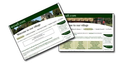
| the
client - Wysall & Thorpe in the Glebe Parish Council, in conjunction with Rushcliffe
County Council, Nottinghamshire
the
brief -
a website was required including an online village notice board, local news, groups
& events, photo gallery, historical & local area information, directory
of local services, useful links, Parish Council minutes and e-mail address collection
for newsletter mailers.
|
the
creative - contemporary classic logo, font and visual style incorporating a stylish green
& cream colour palette. The village's tradition is reflected in specially
commissioned photography depicting current landmarks and historical heritage.
Rotating village images differ each visit and, along with ongoing monthly content
management, ensure the site stays fresh and up to date encouraging regular visits.
the
result - the site captures numerous 'village touches' including the church, the Plough
Inn, the Village Hall, other notable buildings, red telephone box and road signs,
all encapsulating everyday life in Wysall.
An online survey of local residents'
views and requirements ensured the content is in line with local expectation.
A monthly email newsletter 'Connections' keeps local residents and others who
may have moved away in touch with local news, facilitates paper-free communications
and keeps distribution time & costs down'.
|
|
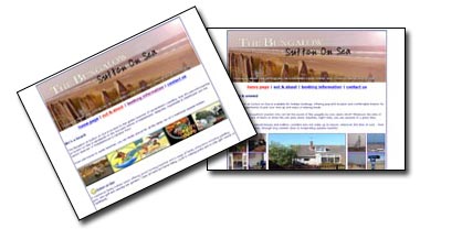
| the
client - The Bungalow at Sutton on Sea holiday-lettings property on the Lincolnshire
coast.
the
brief -
a website was required to attract new customers who are interested in renting
a holiday cottage and are searching the web for ideas. The site was required to
emphasise key features of the property - facilities, location, local attractions
and include links to other related sites including Lincolnshire resorts &
Wolds villages, Funcoast and other local tourist attractions.
|
the
creative - a distinctive 'seaside/holiday' look & feel has been developed for the business
and the website including a distinctive beach-themed logo combining contemporary
quality font (The Bungalow) with a friendly personalised font (at Sutton on Sea)
and attractive original imagery capturing the holiday feel and the high standard
of the accommodation.
the
result - 'a sunny feelgood site. The client was particularly pleased with the eye-catching
special offers flash-animated banner; hand-written-font endorsed testimonials
and a printable booking form.' |
|
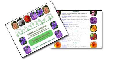
| the
client -gardenmates
offer a general garden maintenance service - including hedge trimming, lawn cutting,
pruning & regular upkeep services, across Nottinghamshire, Leicestershire,
Derbyshire & Lincolnshire.
the
brief -
gardenmates work with clients to make the most of their existing gardens, rather
than ripping out & starting from scratch. At the same time they provide suggestions
& ideas to improve what is already there.
A
website was required to:
- outline the services which gardenmates offer personally
- provide advice, inspiration, information & suppliers for garden requirements
- various plants, patios, fencing, conservatories, garden furniture, stoneware,
garden toys
- offer links to related sites & facilities to feed back information
|
the
creative -The look & feel of the site combes the vibrant colours of summer blooms with
the peace & tranquillity of an English country garden setting. Visually based
around floral imagery and ivy leaves framing the content of the page and audibly
incorporating 'in an English country garden' music.
the
result -'The site is packed with information and has excellent links to a wide variety
of selected links, providing information & inspiration. The URL links are
making it very popular with search engines and generating lots of interest in
gardenmates'. |
|
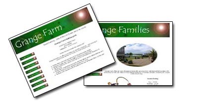
| the
client - Grange
Farm Leisure Ltd - camping & caravanning park with fishing lakes, located
in Mablethorpe, Lincolnshire
the
brief -Grange
Farm is located between the lively coastal resorts of Mablethorpe & Skegness
and peaceful countryside. Our client was looking for a cohesive identity and theme
for the park.
A website was required to:
- link the varied appeals of the adjacent Lincolnshire Wolds and coastal resorts
- provide
information on things to do, places to eat & drink and local facilities
- introduce a photo gallery and events update for the community of holiday home-owners
on the park
- offer links to related sites & facilities to feedback information
|
the
creative -The look & feel of the site reflects the sun shining through onto the waters
of the fishing lakes.
Grange Farm is positioned as the central link for the
excellent angling facilities (Grange Fishing Lakes), the tranquillity of the nearby
Wolds (Grange Feelgood), the excitement of all-action holiday resorts (Grange
Families), the variety of local restaurants & pubs (Grange Food & Drink)
and the special moments with friends, neighbours & family (Grange Funtimes).
the
result - 'The site is good
looking, nicely put together & navigates well. It is packed with information
and has excellent links to a wide variety of local places of interest. The URL
links are making it very popular with search engines so that Grange Farm is visible
for those planning a holiday in the area. Particular likes were the photo gallery'. |
|
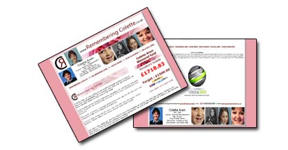
| the
client - The Colette Aram Memorial Fund. The death of Colette, a teenager murdered 26 years ago was the first ever case featured on BBC One's Crimewatch programme.
the
brief - The fundraising appeal was set up by two former classmates of the murdered Nottinghamshire schoolgirl aiming to raise £1000 to put up a memorial in Keyworth. A website was required to boost public awareness of the campaign, to provide a channel for donations and to keep people up to date with what was being achieved. |
the
creative - vista360 were delighted to donate our services free of charge to support the fundraising efforts, developing a website based around archive photography of Colette, fundraising updates and a simple to use donation mechanic.
the
result - the fund has currently raised a staggering £1718.83, almost double the original target of £1,000. Donations have poured in, both from individuals and local businesses.
The website (www.rememberingcolette.co.uk ) boosted the fundraising and Allison Wood, founder of the Trust commented ‘The website made donating to the memorial Fund much easier and kept people aware of how the efforts were progressing’. |
|
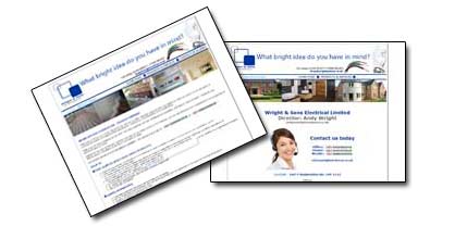
| the
client - Wright and Sons Electrical Contractors Ltd, deliver reliable, practical and cost-effective electrical solutions for domestic & commercial clients throughout Nottinghamshire, Derbyshire, Leicestershire and Lincolnshire.
the
brief - A website was required to emphasize the fully qualified, professional advice & expertise, quality workmanship, excellent reputation & reliability, safety & peace of mind and cost effective solutions provided by our client. |
the
creative - vista360 designed a new logo for our client, optimised to be fast-loading on the website and to develop a consistent brand identity it is now being introduced across van graphics and all printed materials (business cards, letterheads). The site included an online catalogue of Products & services offered (including Home heating systems, Domestic Garden Lighting & Features, Kitchen, Bathroom & Other Home Improvements, Home & Property Security, Safety Inspection and Testing and Commercial Installations).
the
result - Photographic imagery was incorporated to reflect safe installations & quality workmanship and to reflect the importance of protecting homes & commercial premises from risks of electrical faults from wear & tear, poor installation, or cut-price electrical works. Overall the copy content and images conveyed the first rate customer service and professional expertise offered by our client. |
|
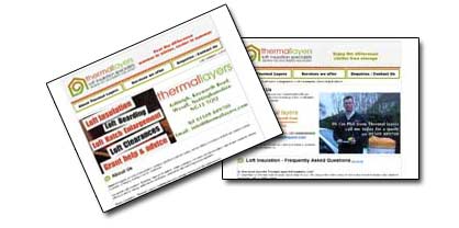
| the
client - Thermal Layers are a local independent company providing loft insulation, boarding, hatches & ladders, clutter clearance, hot water cylinder insulation, pipe & tank insulation, energy efficiency advice, energy performance certificates and assistance with switching energy suppliers.
the
brief -with recent heightened public & media interest in the cost-saving & environmental benefits of home energy efficiency and requirement for Energy Performance advice & certificates, Thermal Layers contacted us to develop a website showcasing the services which they offer.
|
the
creative -a property-insulation based logo, consistent with paper flyers, vehicle signage etc was adapted for web usage and client photographs were incorporated to give a ‘face’ to the company. With several insulation services available the site includes an online brochure of the types of work undertaken and provides reassurance about the professional reliable services offered along with information on the benefits of energy efficiency.
the
result -supported by links to related energy-efficiency sites to attract more visitors to this site, the professional site ‘look & feel’ underlines the reassurance of a reliable and trustworthy company, providing a prompt quality service without the hassle of 0800 call centres and the frustration of lengthy waiting times for installation. |
|
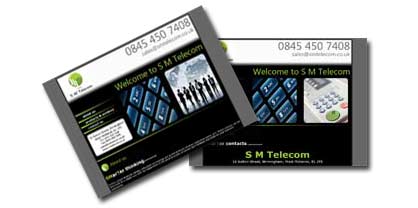
| the
client - S M Telecom was formed to provide business customers with a one-stop shop consultancy service to cover all of your communication requirements. With over 20 years experience in fixed line, mobile and private mobile radio products and services, SM Telecom have key partnerships with companies who excel in delivering excellent cost – effective solutions, based around excellent customer focus and high level customer service.
the
brief -In the current financial climate, potential cost savings, with no compromise in quality of service & minimum operational disruption are at the forefront of most companies’ plans. S M Telecom, working in partnership with Tier 1 network providers, required a website to showcase their range of solutions for business & mobile solutions, fleet management and office services.
|
the
creative - SMarTer solutions outlined our client’s portfolio including fixed line telecommunications, telephone systems, mobile solutions for traditional mobile phones or two-way radio communications, business office solutions and vehicle tracking and fleet solutions. SMarTer thinking outlined our client’s expertise and approach to projects.
the
result - A specially-designed logo, sourced imagery along with logos & links to related sites (partners, professional bodies, etc) effectively endorse our client’s business as a professional forward-looking company. |
Drenajecostadelsol - Spanish Drainage company - (back to top)
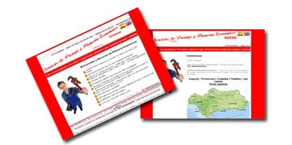
|
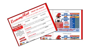
| the
client - our existing UK client www.economyrod.co.uk one of the UK’s leading privately owned drainage companies, was planning to launch a Spanish company providing similar services throughout Malaga & Gibraltar.
the
brief -A Spanish/English dual language website was required to target both Spanish and English speaking customers in these areas.
|
the
creative - A mirror-image English/Spanish website was required to target both nationalities, including CCTV Surveying (CCTV medición), High-pressure Water Jetting (Agua con chorro de presión alta), Root infiltration (Eliminación de Raíces) and Drain Relining (Revestimiento de desagüe).
The site required clear structure and navigation to ensure consistent formats between the two language variations.
the
result - Key messages reflected the main services offered and also conveyed key brand benefits, including Quality service (Servicios calidades), Competitive rates (Ofrecemos precio rasonables), Call now for free estimate (Llame ahora para pedir estimado gratis). Photos were included to add visual appeal, including well equipped vehicles (vehículos muy bien equipados). |
Fumigacioncostadelsol - Spanish Pest Control - (back to top)
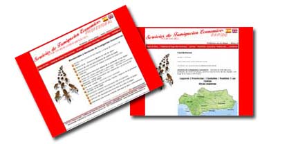
|
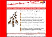
| the
client - our existing UK client www.economykill.co.uk one of the UK’s leading privately owned nationwide pest control companies, was planning to launch a Spanish company providing similar services throughout Malaga & Gibraltar.
the
brief -A Spanish/English dual language website was required to target both Spanish and English speaking customers in these areas.
|
the
creative - A mirror-image English/Spanish website was required to target both nationalities, including Home Page (Página de inicio), Common pest problems (problemas de plagas más communes), industrial, commercial & residential services (servicios – industriales, comerciales y residenciales), and Contact us (Contáctenos). The site required clear structure and navigation to ensure consistent formats between the two language variations.
the
result - Key messages reflected the main services offered, including Pest problems (Problemas con las plagas), Rats, mice and other rodents (Ratas, ratones y otros roedores), Insects & Spiders (Insectos y arenas), Birds (Pájaros), Snakes & lizards (Serpientes y lagartos).
The site also conveyed key brand benefits, including Quality service (Servicios calidades), Competitive rates (Ofrecemos precio rasonables), Call now for free estimate (Llame ahora para pedir estimado gratis). |
|
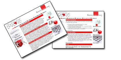
| the
client - Formed in 2002, The Business Advice Team Limited has developed into a formidable
team of consultants operating throughout the UK with a strong track record of
successfully working with small businesses, multinationals and the public sector,
delivering research, consultancy, and technical assistance to improve business
operations through innovation and to achieve increased turnover and profit margins.
the
brief -
redevelop & relaunch the client's existing website targeting SME & pubic
sector businesses, to maximise business achieved from the existing market sectors,
generate wider awareness & attract new customers searching online and to encourage
existing clients to see you in new ways & consider other services.
|
the
creative - The existing logo was adapted to further develop & support a consistent
distinctive brand-identity and to visually & verbally bring the company personality
to life. The 'look & feel' included aspirational headings to communicate key
brand values (Professional, Vibrant, Individual, Creative and Innovative) and
overall upbeat copy tone. Ongoing content management and email newsletters are
to be introduced to ensure site relevance and freshness. Redbox imagery was incorporated
to add visual appeal, using one element of the current logo more creatively.
the
result - The new site structure has significantly increased visitor & search engine
friendliness. The visitor experience was enhanced through simplified new navigation
& structure, easier to use 'contact us' and easier 'find us' directions. Search
engine optimisation & submission was supported with incorporation of key word
metatags, which potential clients may search on (e.g. Grants/Funding, Project
management, Product Technology) to attain higher positions in search engines listings. |
|
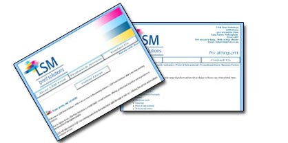
| the
client - With over 40 years in the printing industry, LSM Print Solutions deliver a one
stop printing solution, offering professional expertise and experience to ensure
print of the highest quality.
the
brief -
A website was required to generate wider awareness & attract new customers
searching online, create an online brochure of the services offered and to create
an online enquiries page with auto response.
|
the
creative - An eye-catching, fast loading and easy to use website with logo and creative
'look & feel' based on primary print colours. Content emphasised key LSM brand
deliverables including Total print solutions, Fast track to quality print at competitive
prices, Excellence in customer service, Simply - higher quality, lower cost, faster
print results.
the
result - An online catalogue 'for all things print', outlined the range of products &
services offered, including Business cards, Brochures & Booklets, Business
stationary, Leaflets, Flyers & Postcards, Folders, Christmas cards, Calendars,
Point of Sale material, Promotional items, Banners, Posters and Exhibition Graphics.
A client portfolio with testimonials was included and an online form developed
to Request a quote. |
|
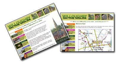
| the
client - Willoughby on the Wolds Parish Council approached us to develop a village website,
incorporating a wide range of useful & interesting sources of information.
the
brief -
Website content to include local weather forecasts, a diary of forthcoming events,
a welcome pack of local services and a picture gallery of recent & past events
over time. Information also incorporated for local groups, including Village Hall,
Bowls Club, Church, Play Group, School & Parish Council, along with local
area photographs & information, features of interest, walks & places to
visit.
|
the
creative -A classic contemporary font style and logo was developed with a green (countryside/environment)
colour palette throughout, along with vibrant primary colours for the keys to
brighten the overall look.
Experience from other sites has emphasised the importance
of fresh, relevant, up to date information so the site includes ongoing regular
content management supported by regular email newsletter updates.
the
result - Specially commissioned local photographic imagery captured the feel of the area
and life in the village. Site navigation buttons were developed for each page
using local images to depict the subject, including Welcome signpost for the Welcome
Pack page, Directional signpost for the Local Area page, Village Hall for the
Parish Council page and Pillar-box for the email newsletter sign-up.
Images
were also included in a gallery with thumbnails for enlarged viewing and emerging
page header flash-animated banners adding visual appeal & interest.
Overall
- clearly laid out, easy to navigate and visually enticing and another client
who commented very favourably on the vista360 service. |
|
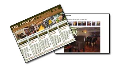
| the
client - The Leisure Complex, based in Hucknall, offers a range of amenities including
The Leisure Lounge (fine dining in contemporary surroundings), The Leisure Suite
(state of the art Leisure Facilities) and The Leisure Club (live music, comedy,
top tribute bands & themed events venue).The venue is also conveniently located
and offers quality facilities for wedding receptions, special occasions or Conferences
& Meetings.
the
brief -
Several nearby major residential developments along with tram & other city-centre
transport links continue to attract newcomers to the area, interested in quality
leisure, dining out and entertainment, for whom
the facilities are often a
'well kept secret'.
Although running regular local press advertising, space
constraints limit the amount of content that can cost-effectively be included
and a website was required to ensure the ads work effectively and readers can
visit to find out more about the facilities on offer.
The site was also required
to generate wider awareness amongst those booking weddings, functions or conference/meetings/company
training away days.
|
the
creative -A stylish coffee/cream colour palette was used to give a contemporary, classic
feel in line with the decor style of The Leisure Lounge and a Leisure Complex
logo developed, incorporating flash animated graphics to add visual impact when
visiting the site.
The logos and colours were adapted for each element of
the business to give an overall consistent look&feel for the site. Black &
white header imagery was included to give a classic, quality feel.
The site
initials were adapted into TLC paragraph header symbols which support the 'special
little touches' offered by the restaurant, leisure suite and weddings packages.
the
result - Copy & visual content was developed, including sample menus & wine list
for The Leisure Lounge, tribute night posters for The Leisure Club, fitness classes
information for The Leisure Suite, details of wedding/conference options offered
and comprehensive thumbail shots enabling visitors to take a closer look at the
quality & range of facilities on offer.
The overall response from the client
was 'an absolutely superb job!' |
|
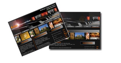
| the
client - KOINE 'a common language', a multi-talented piano & bass duo, who have performed
extensively at home & around the world gaining prestigious awards & critical
acclaim over several years. From background music to lounge music or cocktail
jazz, they offer a range of wedding, private party & corporate entertainment
options and have performed for a range of clients including East Enders cast,
Coronation Street cast, Holiday Inn, Copthorne Hotels, Thistle Hotels, The AA,
The RAC,Yell.com, The Labour Party & GMTV.
the
brief -
a website was required to generate wider awareness & attract new customers
searching online for corporate, weddings & special events entertainment etc)
including an online catalogue outlining the various musical options offered and
links to related wedding, function venues & corporate function bookers' sites.
A second site was also required to target musical booking agents. |
the
creative - in the entertainment sector where image is key, a distinctive brand identity
was developed, with a balance of 'classic, current, contemporary' creative style,
to ensure broad appeal across several diverse target audiences.
the
result - the KOINE 'a common language' name & strapline were developed into an impactful
logo & brand style, incorporating flash animated graphics giving added web-impact
and an easily recognisable brand-identity. Inclusion of 'atmospheric' photography
along with musical demo tracks on each page
emphasized KOINE's specialist qualities
and differentials in this highly competitive sector. Content included Testimonials,
Gallery & Showcase along with separate sections for Weddings & Functions
and Corporate Events. |
|
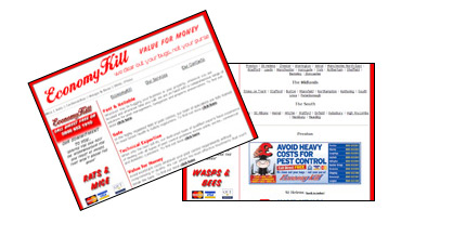
| the
client - EconomyKill - one of the UK's leading privately owned nationwide pest control
companies.
the
brief -
a website was required to generate awareness & attract new customers across
a wider catchment searching the web for pest control services and to create an
online catalogue of the types of jobs undertaken. |
the
creative - consistent with the clients' existing logo as used in print, directory advertising
and van signage, incorporating flash animation graphics to enhance web impact.
Consistent creative style and branding with the already established EconomyRod
site supporting overall branding of the group of companies.
the
result - 'Content and overall look&feel supports & emphasizes key brand benefits
of Speed & Reliability, Safety, Technical Expertise and Value for Money. Local
area telephone numbers throughout the UK in line with Directory advertising style
endorse the strength of a national brand with local engineers. Includes topline
information about the types of pest management services offered, including Rats
& Mice, Ants, Cockroaches, Wasps & Bees, Birds and Fleas along with relevant
legal requirements related to pest management.' |
|
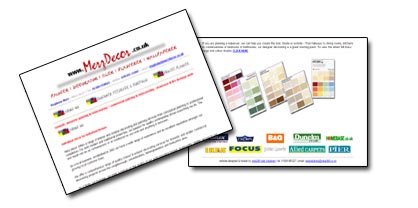
| the
client - Merz Décor offer interior & exterior decorating services for domestic
and smaller commercial decorating projects across the Loughborough, Leicestershire,
Nottinghamshire and Derbyshire area.
the
brief -
with widespread current media and consumer interest in property-improvement, Merz
Décor were keen to launch a website to boost awareness amongst a wider
audience and attract new customers. |
the
creative - the client's existing distinctive logo was adapted for web usage giving online
impact and consistency across van signage etc. The site included an online catalogue
of services offered and a project planner allowing visitors to click onto colour-charts
to make their paint selections in the comfort of their own homes. The site also
includes photographic examples showcasing Merz' attention to detail on interior
& exterior projects along with customer testimonials as further endorsements.
the
result - 'as more & more people are looking at property improvement and with so many
choices of shades & textures the online paint selector really simplifies the
planning stage. Links to other home décor specialists & outlets provide
further inspiration and help attract more visitors to the site. Links include
Dulux. With the paint selector to help plan the project and Merz Décor
to undertake the works to their usual high standards, decorating no longer seems
such a daunting chore'. |
|
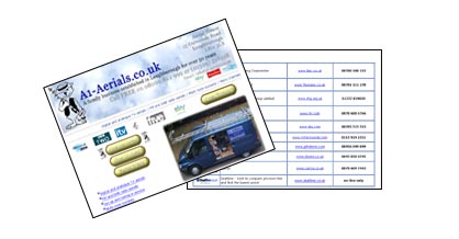
| the
client - A1 Aerials, Loughborough's leading TV aerial & satellite specialist - a
family business who have been Installing TV aerials for over 50 years in the area,
working extensively with home, office, commercial and industrial clients.
the
brief -
with recent expansion of digital TV channels & aerials and the forthcoming
requirement for all homes to have digital aerials a website was required to boost
awareness of the products on offer amongst a wider audience and attract new customers
as the digital technology boom stimulates increased demand. |
the
creative - the client's long-established 'aerial-fitter' logo was adapted into a flash-animated
web logo, giving online impact whilst maintaining consistency across printed materials,
van signage etc. With a mass of new digital products available the site includes
an online brochure of the types of jobs undertaken. The site also provides reassurance
about the professional reliable service offered along with customer testimonials
as endorsements.
the
result - 'as digital technology is currently very heavily advertised links were included
to related aerial/broadcasting suppliers/manufacturers to add impact and attract
more visitors to our own site. Links included
www.bbc.co.uk, www.freeview.co.uk,
www.itv, www.sky.com, along with key TV retailers including Richer Sounds, John
Lewis, Dixons & Currys.
The professional site 'look&feel' gives the
reassurance of a reliable, trustworthy and forward-thinking company'. |
|
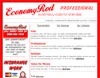
| the
client - EconomyRod - one of the UK's leading privately owned nationwide emergency plumbing
and drainage companies.
the
brief -
a website was required to generate awareness & attract new customers across
a wider catchment searching the web for plumbing and to create an online catalogue
of the types of jobs undertaken. |
the
creative - consistent with the clients' existing logo used in printed materials, van signage
and directory advertising, whilst adapted for web impact using flash animated
graphics. Clearly laid out content including topline information about the business,
products & services with click-through's for more detailed information as
required.
the
result - 'professional looking, enhanced with movement and impact from the flash animation.
Local area telephone numbers accessible wherever visitors are located throughout
the UK endorsing the strength of a national brand with the speed & reliability
of local engineers'. |
|
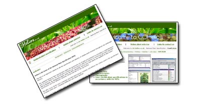
| the
client - working in conjunction with the Landscape Institute and The Horticultural Trades
Association goHelios is the home of the national plant specification, an interactive
database providing over 14,000 plant specifications including details & photographs
and a national plant selector tool soon to be launched online.
the
brief -
the national plant selector is currently available on CDrom shortly to be launched
as a full online database for which a 'shop window' generating awareness &
attracting new purchasers of the information is required. Fast loading, clearly
laid out, professional looking online content was key to display a large volume
of information in a user-friendly way.
|
the
creative - a fast loading, easy to navigate site with clear layout, professional style
and concise content, essential for its highly technical target audience and complex
subject matter. Plant photographs and images provide visual relief to an otherwise
text-based resource and offer tempters for the national plant selector program
with sample 'grabs'.
the
result - 'contemporary feel including a flash animated logo give enhanced visitor experience
and heightened profile of the national plant selector ahead of planned online
launch. The site includes web-optimised sample photos within the body avoiding
the need to open numerous PDF's. Overall a strong balance between a massive volume
of technically complex data and the need for simple navigation, visual appeal
& speed of loading'. |
|
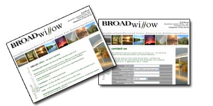
| the
client - Broadwillow Limited - training & short courses, consultancy and small business
support, based in Nottingham.
the
brief -
an online presence was required to generate awareness & attract new customers
looking online for the services offered by Broadwillow.
The website was required
to outline the different training, consultancy & support services offered
including Microsoft support, short courses in IT related business activities,
consultancy and small business support.
|
the
creative - clearly laid out to link the diverse range of services offered. Client imagery
is utilised to ensure visual appeal and a clearly recognisable Braodwillow logo,
incorporating willow-leaves, is included on the site & for adaptation across
printed materials & other media. URL links to related sites are included to
drive visitors to Broadwillow.
the
result - 'The site features user-friendly fast-loading photography and the overall look&feel
is crisp&clean to reflect the professionalism expected of a business consultancy
& support company'.. |
|
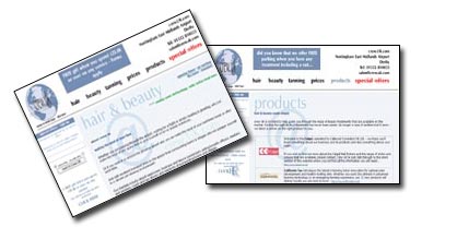
| the
client - crew.UK Hair, Beauty & Tanning Salon based at Nottingham East Midlands Airport,
Castle Donington
the
brief -
an online presence was required to generate awareness of crew.UK's recently extended
range of hairdressing, beauty & tanning treatments amongst existing customers
and to attract new customers who may not be aware of the salon.
The website was required to target:
- leisure & business passengers with time to spare whilst awaiting flight departures
- employees of local businesses in and around the airport
- those who are interested in the services provided & searching the web for
local studios
- visitors to other related sites including the NEMA airport facilities site, related
health & beauty sites, local health clubs, holistic & other treatments
|
the
creative - the contemporary & distinctive brand 'look&feel' of crew.UK has been
adapted into a user-friendly website. A colour palette based on pastel blue, emphasises
the crew.UK brand values of style, image, well-being, pampering, professionalism
& customer service. Content includes crew.UK & the team, hair services
offered, skin&beauty treatments, products stocked, rate card, products offered
and introductory web offers.
the
result - 'The site is crisp, clean & clearly set out with a 'look good, feel good'
theme throughout. It is full of special offers which are content managed to ensure
visitors keep checking the site - supported by recently launched html email offer
updates to a base of subscribing email addresses. The 'contact us' section is
already collecting appointment requests from business passengers around Europe
flying into the airport with time to spare for a little self-pampering before
their meetings'. |
|
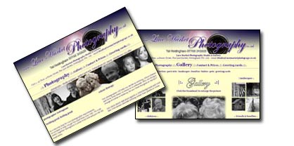
| the
client - Lace Market Photography - Studio & Gallery, portrait photographer based
in Nottingham's historic Lace Market
the
brief -
an online presence was required to generate awareness & attract new customers
who are looking online for photographic services.
The website was required
to:
- build a 'gallery' of Lace Market Photography work as a reference point for prospective
customers
- outline the different photographic products & services offered
- convey the personal service offered to customers, versus more impersonal &
standardised service offered by larger chains of photographic suppliers
|
the
creative - classic but contemporary style, showcasing the distinctive black&white portfolio.
Cream & burgundy background and italicised logo font give a stylish context
for the range of photography offered and emphasise core brand values of professionalism,
reassurance, quality, expertise, trust, experience and value for money.
the
result -'The site features user-friendly fast-loading photography with facility to click
onto thumbnail shots & expand any which are of interest. The site also features
scanned in visuals of the range of gift cards, which Lace Market has recently
launched and is keen to develop. Already adapted into other artwork including
tailored catalogue, ensuring consistent branding and the stylish 'look&feel'
expected of a creative photographic studio. |
|
| the
client - esprit transportation services ltd is a Birmingham-based international distribution
& logistics company.
the
brief -
esprit has never had an web presence and required a site to generate awareness
& attract new customers who are looking to source transportation services
online
The
website was required to:
- outline
the different services & equipment available
- emphasise the esprit brand values of efficiency, reliability, adaptability, professionalism
& customer service
- convey esprit as a professional & forward looking company, through its online
presence
- introduce an easily recognisable web address to be used on all company literature
- catalogue, business cards, vehicles, etc.
|
the
creative - the look & feel of the site builds on the distinctive logo and adapts the
brand style into a user-friendly website, incorporating 'racing green' colour
palette, with imagery reflecting the professionalism of the company.
The creative
style complements parent-group Greenwoods web style.
the
result -'The site exceeded the MD's expectations with a professional 'look&feel'
and distinctive appearance which is absolutely critical in the highly competitive
transportation sector. It features comprehensive and easy to access information
on the various services which esprit offer. Particularly liked the online order
form enabling esprit to respond quickly to any customer enquires and the innovative
'pay per click' recommendation enabling esprit to 'purchase' visitors looking
specifically for the service that they offer'. |
|
| the
client - The
Plough Inn, Wysall, Notts.
the
brief -
The Plough Inn is one of Nottinghamshire's best known village inns, located in
the picturesque village of Wysall.
A website was required to:
- outline
the facilities offered by the Plough, including beer garden, lounge, bar &
lunchtime dining
- provide
information on food & drinks served (including list of fine wines/malt whiskeys
and cognacs)
- offer
information on local walks and visitor attractions
- establish
a guestbook for current regulars & previous visitor
|
the
creative - The look and feel of the site with stylish cream background, burgundy borders
and gold headings, reflects the warm and elegant surroundings of the recently
refurbished inn. Specially sourced imagery captures numerous distinctive features
that make up the ambience of the pub (beamed ceilings, exposed brickwork, antiques,
paintings, freshly cut flowers, red telephone box) and the well stocked bar (hand-pulled
ales, fine whiskeys & champagnes).
the
result -'The site is visually attractive reflecting the traditional yet elegant feel
of The Plough. It includes useful information including current wines selection,
opening times and special events. The site is well structured and navigates well.
Particular like was the visitors' book for current locals & past 'friends'
of The Plough'. |
|
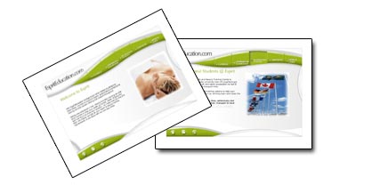
| the
client - EspritEducation, an international hair and beauty training centre, based in
Loughborough.
the
brief -
to generate awareness amongst potential students in the UK & internationally,
searching online for hair & beauty training courses and to outline the different
courses available |
the
creative - a distinctive stylish & contemporary brand 'look&feel' has been developed
and adapted into a fast loading, easy to navigate website. Flash animation graphics
ensure the site is vibrant & eye-catching, tempting potential students to
delve further into clearly laid out more detailed course prospectuses and information
on funding, accommodation & local services.
the
result - 'the visual style and site music give a pampering, relaxing feel - perfect for
a health & beauty client. Student success stories add human-interest and give
the feel of a company with lots happening and really going places. The site is
packed with information but its clear layout and visitor-friendly structure ensures
relevant information can be readily accessed. Overall the site endorses the EspritEducation
brand as professional, forward looking and an international player in health &
beauty training'. |
|
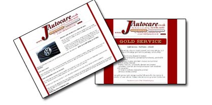
| the
client - J Autocare
offer a professional, reliable, established car valeting service, based in the
South Nottinghamshire area.
the
brief -
In addition to flyers & door-drop mailings, J Autocare wish to generate awareness
& attract new customers who are looking to purchase car valeting services
online.
J Autocare is part of the J Enterprises group, initially incorporated
as an endorsement but with scope to broaden as an umbrella site encompassing other
parts of the group at a later date.
A
website was required to:
- outline the different product types (gold & bronze packages)
- develop a distinctive 'look&feel'
- emphasise the J Autocare brand values of professionalism, reassurance, expertise,
experience, trust, total mobility & security
- convey J Autocare as a professional & forward looking company, through its
online presence
- introduce an easily-recognisable web address to be used on flyers, business cards
etc
|
the
creative - The look & feel of the site builds on the distinctive J Autocare logo, incorporating
stylish italicised font & burgundy colour palette, reflecting the prestige
& professional service offered. Specially sourced imagery captures numerous
'little touches' that make the overall valet special - headlamps, dash, interior,
etc.
the
result -'The site exceeded client expectations with a distinctive & classy appearance
and clearly laid out information on the various packages offered. Particularly
liked the separate sub-branding which was introduced for the tailored packages
offered (gold service and silver service).' |
|
|
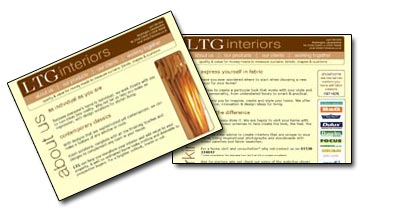
| the
client -LTG interiors
were looking to expand their recently established home furnishings business in
the Leics, Derbys, and Notts area and to publicise the services they offer with
a dedicated website.
the
brief -
A website was required to:
- generate awareness & attract new customers who are looking to purchase home
furnishings
- outline the different products & services offered (curtains, blinds, pelmets
& accessories)
- emphasise the LTG brand values of professionalism, reassurance, quality, trust
& value
- convey the ease & personal service vs more impersonal & standardised larger
suppliers
- reiterate LTG as a professional & forward looking company, through its online
presence
- introduce an easily recognisable web address to be used on flyers, business cards
etc
- build a 'gallery' of LTG products & designs as reference point for prospective
customers
|
the
creative -A distinctive company name & logo, incorporating stylish contemporary font
was developed, with the site 'look&feel' based on a contemporary classic,
non'Chintzy' design. Incorporates specially soucred imagery capturing numerous
'little touches' which make the overall LTG products special (swags, tails, tie-backs,
accessories etc), a chocolate/coffee/cream & brown colour palette and related
weblinks to non-competitive sites (paints, carpets, furniture, fabrics).
Includes 4 pages (about us, our products, our clients & working together)
the
result -'the site & logo captures exactly the contemporary classic feel our company
was aiming for. The special sourced photographs capture the attention to detail
LTG prides themselves on.
As a design company ourselves we were delighted
with the stylish brand identity vista360 produced for us'. |
|
|
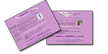
| the
client - Anne Howie
Associates based in St Albans are an accredited practitioner of reflexology and
also offer various education, careers & psychometric services,
the
brief -As
a member of the Association of reflexologists the main focus is an outline of
the benefits & services offered, including treatments at home or in a dedicated
centre, demonstrations to interest groups, seminars and gift vouchers. A growing
range of complementary services are also offered.
A
website was required to outline the services which Anne Howie offer:
- advice &
information on refelexology and its benefits
- education services including private tutoring or agency supply
- career development including CV & interview preparation and presentation skills
- psychometric testing including ability & personality questionnaires
|
the
creative -The look & feel of the site incorporates a professional & distinctive
logo as an umbrella linking the various diverse services offered. A lilac colour
palette lends a refreshing, relaxing & inspirational background. Key phrases
outline the benefits offered by each service, including rejuvenation, relief,
success & achievement.
the
result - 'The site links the diverse services in a crisp, cohesive manner with key inspirational
phrases conveying the physical & emotional benefits of each service offered.
The site is fully optimised, with each page fast loading, easy to navigate and perfectly coded'. |
|
|